CSS viewport units like vw, vh, vmin, and vmax have had great browser support over the years. While these units work just fine in almost all scenarios there is one particular case on the mobile medium where the height viewport unit fails subtly.

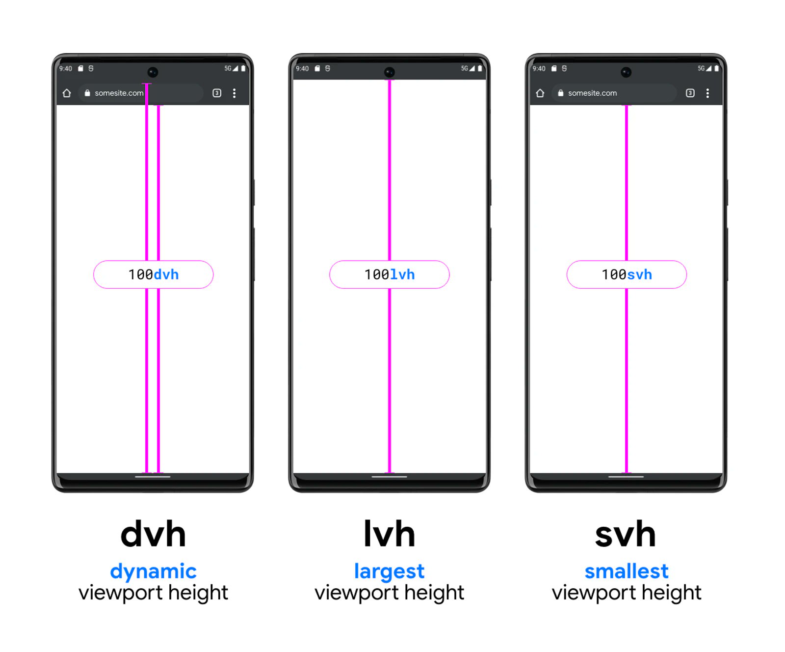
As per standard implementation, since the year 2015, the value of 100vh has usually matched the larger viewport state (see figure below). The problem with this implementation is that some of the UX/UI of a "full screen" web-app tends to fall below the fold due to the browser interface taking up space at the top. When the viewport state is small (or the browser is in expanded state), 100vh would be longer than the available height on the screen. It appears like a minor nit, but it has had a significant impact on mobile design experience over the year.
To resolve this issue, we now have a few new css level - 4 viewport units to play with.
Meet svw, lvh, and dvh
svh- small viewport height.lvh- long viewport height.dvh- dynamic viewport height.
According to the spec, the small viewport is when the browser interface (the url/address bar etc.) is fully visible, long viewport is when the browser controls have retracted, and dynamic viewport unit is either of the two values above that the browser will set natively depending on the state.

.element {
  height: 100dvh; /* See result in the first screenshot */
}

.element {
  height: 100svh; /* See result in the second screenshot */
}

.element {
  height: 100lvh; /* See result in the third screenshot */
}
Apparently, the new height variant unit is broken on the macos desktop.
But since Toucaan uses a css router to separate stylesheets according to mediums, usage of the new viewport variants is recommended for only the mobile interfaces. The desktop can continue to be solved with the older viewport units.
Intrinsic Determinism
Among the new variants of the viewport units, we also have the dvmin & dvmax css units. These two form the backbone of our font-size utility variables on mobile.
Example:
Here's a quick real world example explaining how to use dvmax on your mobile views with Toucaan:
To apply a predetermined page-length to your webpage:
/* On mobile: */
body {
  height: calc(10 * 100dvmax); /* A 10-pages long scroll for mobile. */
}
Learn more about the Concept of Firm Pagination for intrinsically scaling UX/UI.
